|
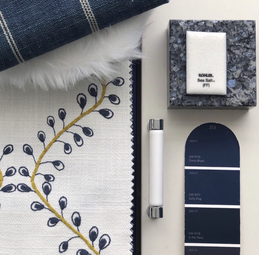
Entering into the first week of fall, before we turn to pumpkins and all things orange and black and pumpkin spice, I’m thinking about color and how it ties in with mood and change. Whether you live in a place with four seasons or two—and with or without this global pandemic lingering on and blurring our sense of time—there is a “feeling” to the end of vacation and the start of school, or as the French call it, la rentrée. With days already beginning to shorten here on the North Olympic Peninsula, one color palette I’m holding onto from summer are the blues, specifically, true blueberry blue and denim blue like this Maxwell Fabric, Podcast. Crisp and clean set against white, cream, or gold and mustard tones, sincere and stabilizing deeper richer blues mirror the transition away from the baby blue skies of summer. Darker blues, like 2020, are serious; and there is work to be done.
0 Comments
Leave a Reply. |
AuthorTrisa Katsikapes, Principal, at Trisa & Co. Interior Design, Port Angeles WA 98362 Archives
June 2021
Categories |
© Trisa & Co. Interior Design Port Angeles, WA All Rights Reserved Last updated November 2023


 RSS Feed