|
Here on the Olympic Peninsula in Washington State, we are fortunate to be surrounded by dozens of small successful family farms. Self-sustainability is not a trend in these parts, it’s a way of life. Staff at garden stores and plant nurseries I’ve visited recently (yes, on my search for the perfect pumpkins and gourds) tell me that since the start of the pandemic in late winter and early spring, their phones have been ringing off the hook. It’s been challenging to keep up with the constant flood of questions from customers suddenly interested in sowing and tending their own edible gardens.
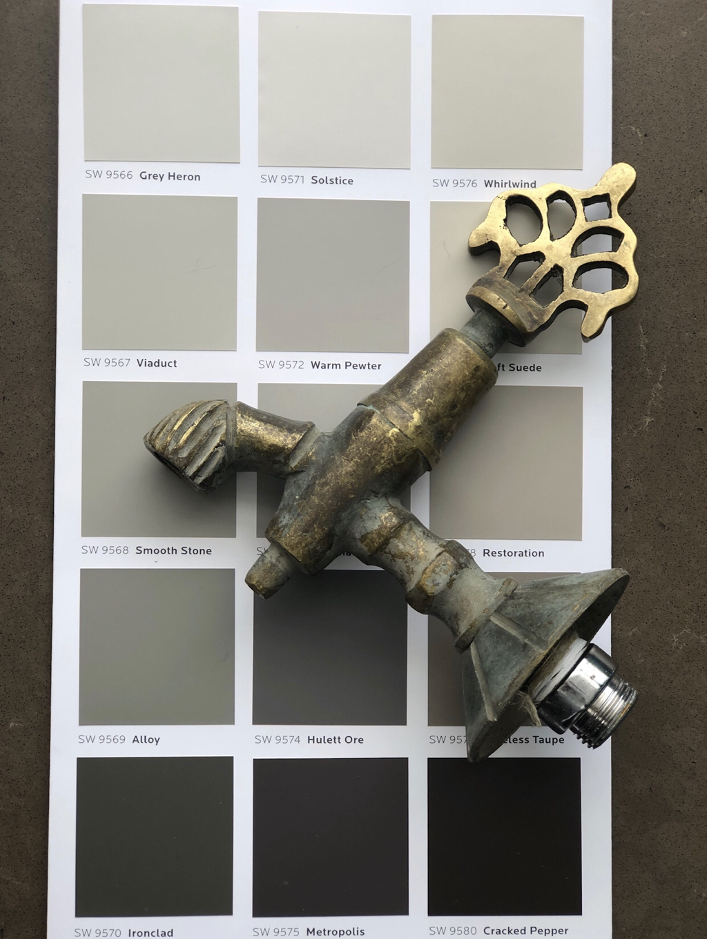
Our soil here is full of clay, and we amend it with dark rich worm casings, compost, and manure. Our moody skies shift from sea to mountain over our valleys with fog, mist, and rain. Through fall and winter, the air smells of salt, pewter, and ore, reminding me of the colors in this Emerald Designer Color Collection palette by Sherwin Williams. Growing up in the Pacific Northwest, I’ve always designed clients’ interior spaces with the outdoors in mind. Earth tones warm and soothe; they feel as familiar as the ground we walk on. Combined with marble or concrete surfaces and punctuated with one-of-a-kind upcycled hardware like this dreamy spigot I treated myself to, from Turkey, earth tones pull together any space—from rustic and rural, to funky and friendly, to urban and sophisticated.
0 Comments
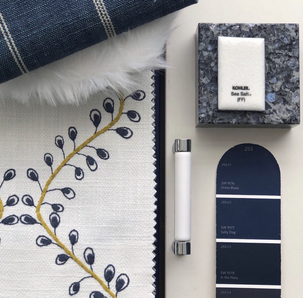
Entering into the first week of fall, before we turn to pumpkins and all things orange and black and pumpkin spice, I’m thinking about color and how it ties in with mood and change. Whether you live in a place with four seasons or two—and with or without this global pandemic lingering on and blurring our sense of time—there is a “feeling” to the end of vacation and the start of school, or as the French call it, la rentrée. With days already beginning to shorten here on the North Olympic Peninsula, one color palette I’m holding onto from summer are the blues, specifically, true blueberry blue and denim blue like this Maxwell Fabric, Podcast. Crisp and clean set against white, cream, or gold and mustard tones, sincere and stabilizing deeper richer blues mirror the transition away from the baby blue skies of summer. Darker blues, like 2020, are serious; and there is work to be done. |
AuthorTrisa Katsikapes, Principal, at Trisa & Co. Interior Design, Port Angeles WA 98362 Archives
June 2021
Categories |
© Trisa & Co. Interior Design Port Angeles, WA All Rights Reserved Last updated November 2023


 RSS Feed